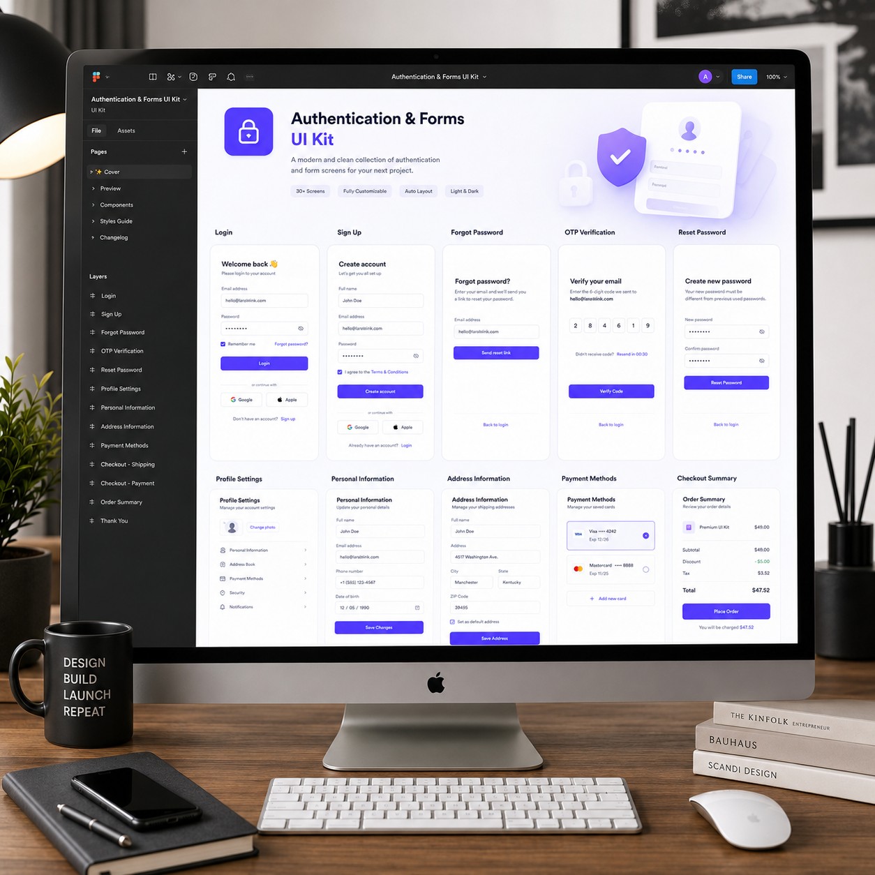
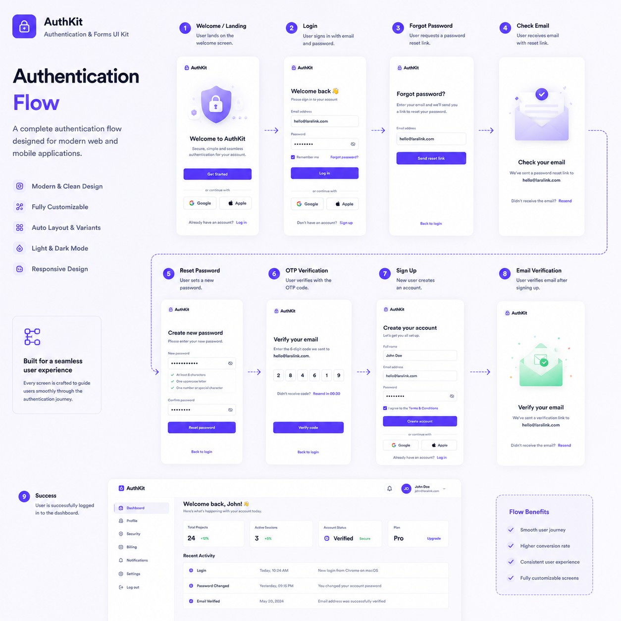
Forms & Authentication UI Kit
$25.00
 New
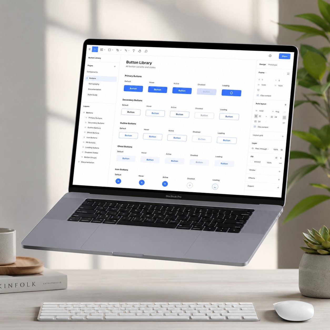
New Creating consistent buttons across a product can quickly become repetitive. The Essential Button Component Library provides a clean, reusable foundation that helps designers prototype and build interfaces more efficiently. Designed entirely in Figma, this library includes professionally organized components with scalable variants, making it ideal for both personal and commercial projects.
Whether you're building a landing page, SaaS dashboard, CRM, mobile application, or complete design system, every button is structured using modern Figma best practices. Auto Layout, reusable components, and well-organized layers make customization simple while maintaining consistency across every screen.
The included documentation explains spacing, typography, corner radius, icon alignment, padding, and component properties, allowing designers and development teams to maintain a consistent design language throughout an entire project.
| Software | Figma |
|---|---|
| Components | 80+ |
| Variants | 12+ |
| Auto Layout | ✅ Yes |
| Component Properties | ✅ Yes |
| Editable | 100% |
| Organized Layers | ✅ Yes |
| Documentation | Included |
| Responsive Ready | Yes |
| File Format | .fig |
Whether you're just getting started with Figma or expanding an existing design system, the Essential Button Component Library offers a practical, affordable collection of reusable UI components that can be dropped into virtually any project. Its clean organization and flexible structure make it a valuable resource for UI/UX designers, product teams, agencies, freelancers, and developers looking to speed up their workflow while maintaining professional design quality.