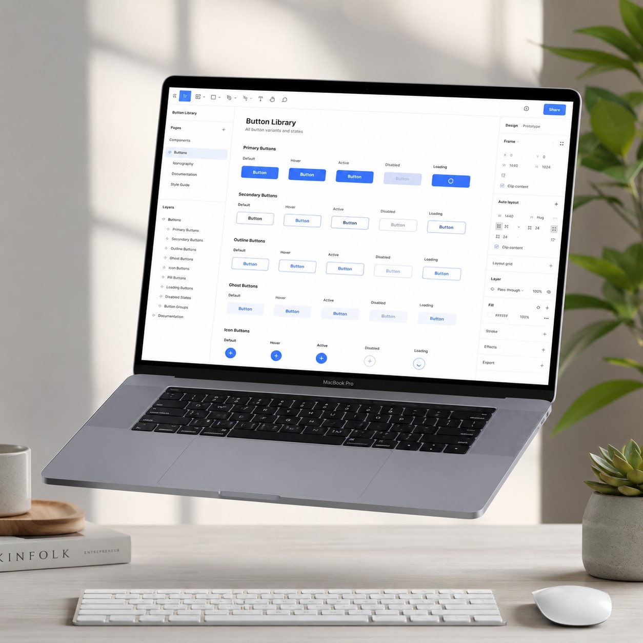
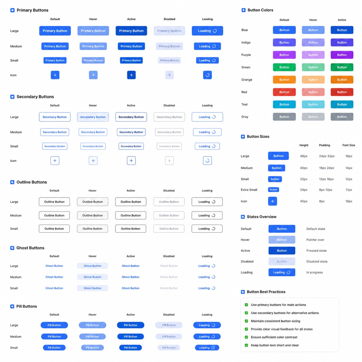
Essential Button Component Library
$1.50
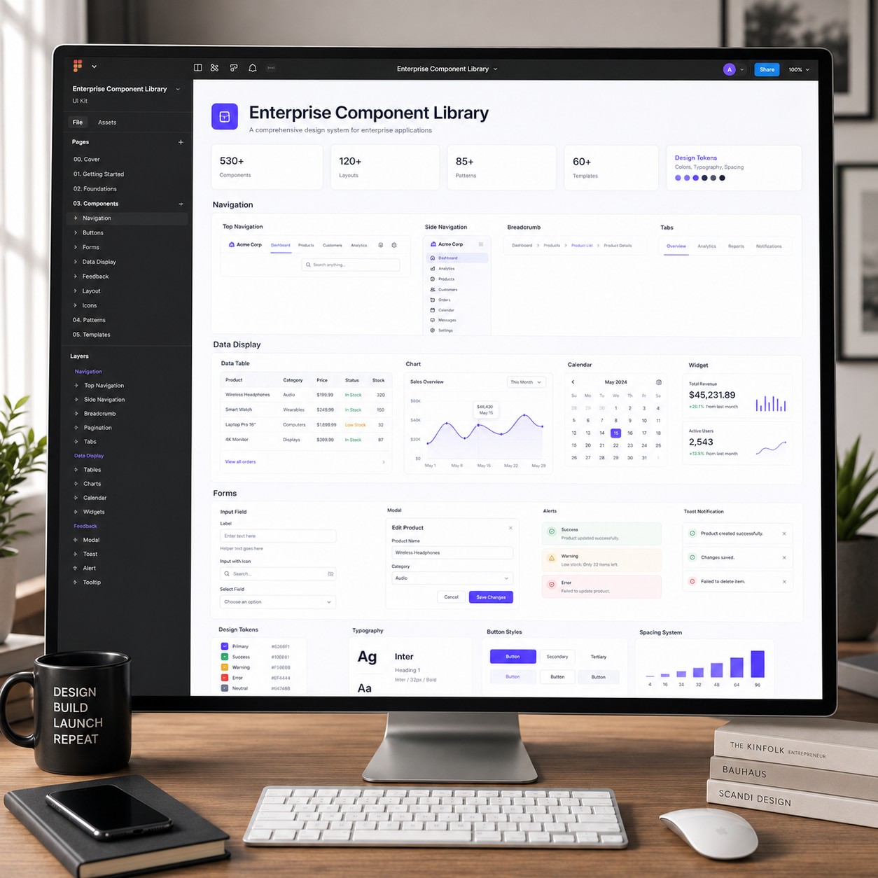
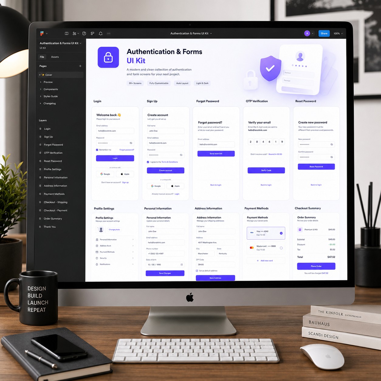
Enterprise Component Library is a comprehensive Figma design system created for professional product teams building large-scale web applications, SaaS platforms, enterprise dashboards, admin panels, CRMs, finance products, analytics platforms, and internal business tools.
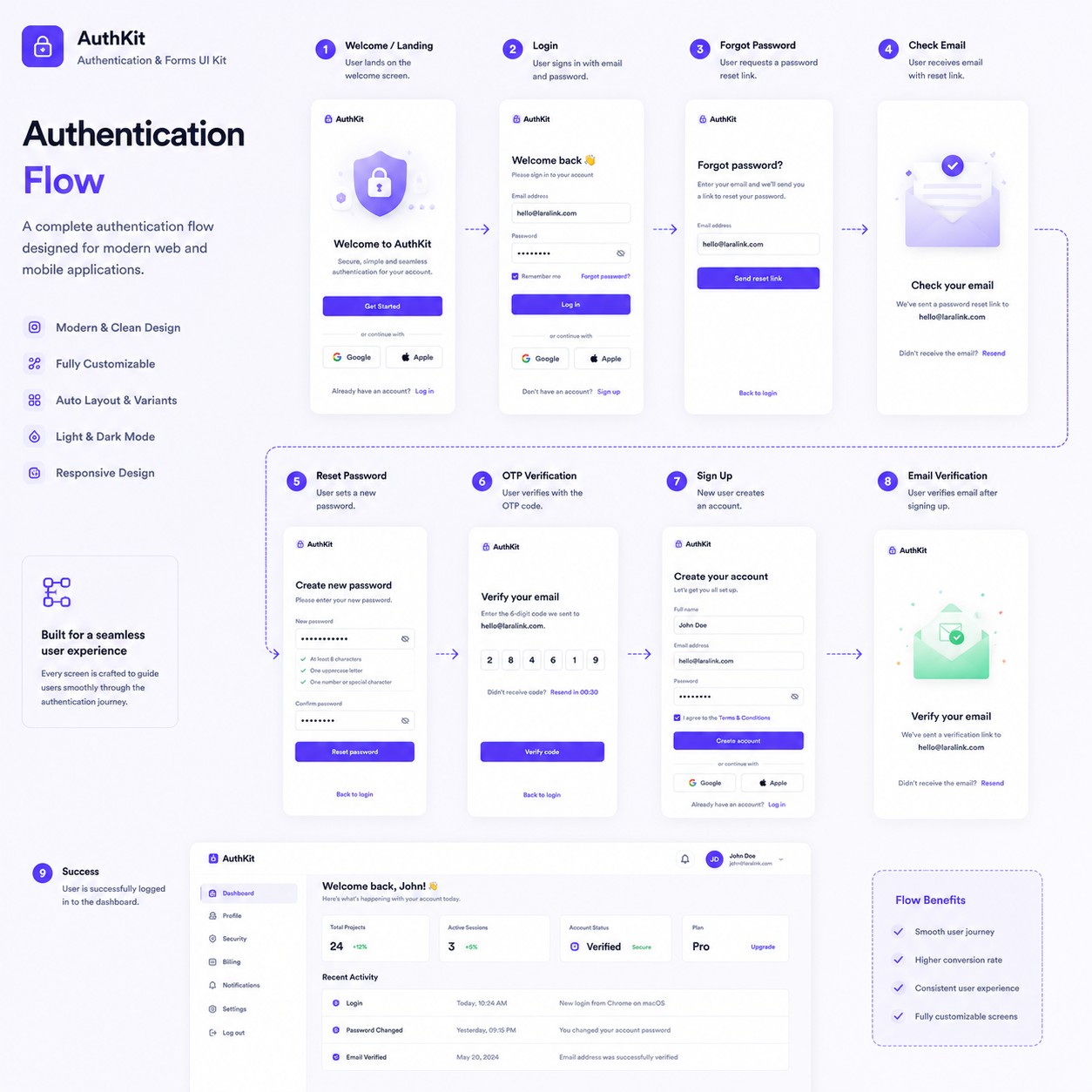
Instead of designing components repeatedly, this library provides a production-ready collection of reusable UI elements that maintain consistency across every project. Every component follows modern design standards, accessibility guidelines, and scalable design system architecture.
Built with Auto Layout, Variables, Component Variants, Design Tokens, and Global Styles, the library is easy to customize, extend, and maintain for teams of any size.
From foundational design tokens to complex data tables, navigation systems, charts, forms, and overlays, every component is carefully organized with documentation and reusable patterns to streamline your workflow.
Every component is fully reusable, allowing designers to build consistent interfaces quickly while maintaining enterprise-grade quality across every product.
| Software | Figma |
|---|---|
| Components | 600+ |
| Component Variants | 8,000+ |
| Layout Templates | 120+ |
| UI Patterns | 85+ |
| Ready-made Templates | 60+ |
| Navigation Systems | ✅ Included |
| Forms & Inputs | ✅ Included |
| Tables & Data Display | ✅ Included |
| Charts & Analytics | ✅ Included |
| Modals & Overlays | ✅ Included |
| Design Tokens | ✅ Included |
| Variables | ✅ Included |
| Global Styles | ✅ Included |
| Auto Layout | ✅ Included |
| Light & Dark Mode | ✅ Supported |
| Organized Layers | Fully Structured |
| Documentation | Included |
| File Format | .fig |
Enterprise Component Library is ideal for UI/UX designers, SaaS startups, enterprise product teams, agencies, freelancers, design system engineers, and developers who need a scalable, reusable, and well-documented Figma component library for building modern digital products with speed, consistency, and long-term maintainability.